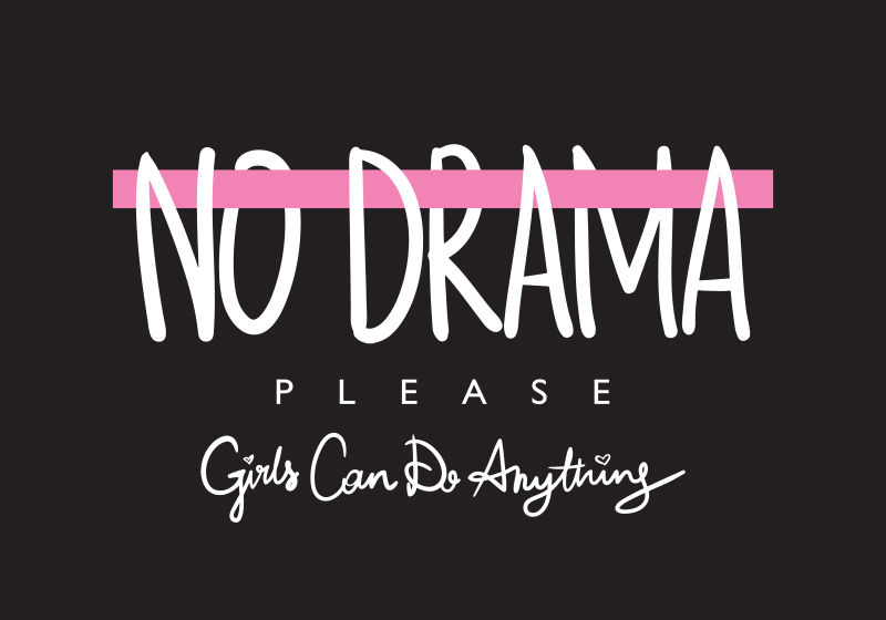
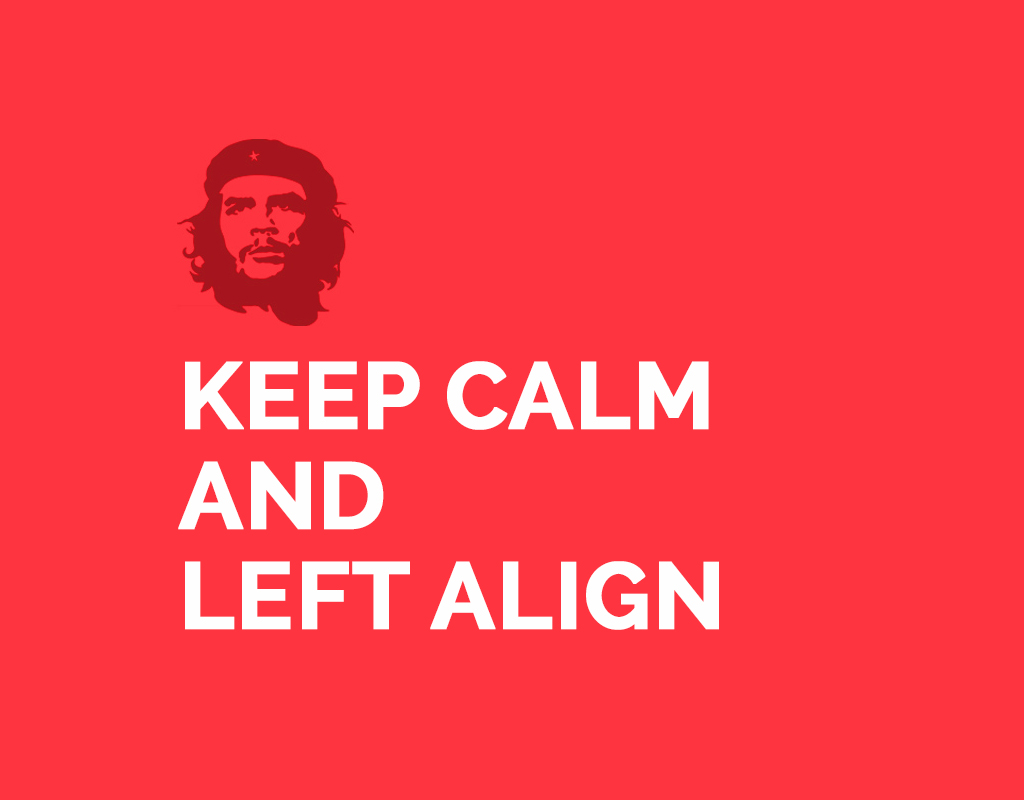
To ensure having an effective communication in your design it is necessary to give it a proper layout. Visual hierarchy involves working with all the resources in the design toolbox – color, contrast, typography, spacing and basic design principles to organize and prioritize the communication in a creative.
Size
Scale up the most important part of your message.
In other words the biggest design element gets the most attention. Enlarging an object’s size (its dimensions) and scale (its size in relationship to other objects) is one of the easiest and most effective ways to give it visual importance.

Colour
Use colour and contrast to direct a viewer’s attention.
Too much colour is a recipe for disaster, but using a smart colour palette makes a creative stand out. Using colours sparingly and purposefully, are key principles here. Colour naturally guides the viewer’s gaze and effectively highlights important information or imagery.

Typography
Use different sizes for headings, subheadings and body copy.
Typographic hierarchy is the most important component of visual hierarchy. To visualize typographic hierarchy, picture a newspaper or magazine article with a headline, subheading, and body copy.

Typeface & Fonts
Every typeface has a personality – choose one that supports your message.
The look of fonts themselves — its category (sans-serif, serif, script, or decorative) and style (bold, italic, small caps, etc.) — can make or break a design. Consider typefaces as personality types. Some typefaces are loud and flamboyant, while some are sombre but interesting, some of them are flexible and adaptive when used purposefully. Use the personalities in a way that resonates with the context of your design to enhance your design. While a typographic hierarchy balances your design and makes it easy to navigate, stylized choices contribute to the design’s mood and provides intended emphasis to the communication.

Spacing
Give your layout balance, flow and focus.
Spacing is one of the most neglected design principles but it’s also one of the most important. White space is essential for separating and organizing the elements in any design. It brings order and give balance to creative. Planned use of unused space is essential for:
i) giving the viewer’s gaze a place to rest and a path to traverse the design,
ii) separating the layout into sections (on the flip side, lies proximity — reducing space to place related items closer together — also an aspect of good spacing).

Visual importance can’t be applied to too many design elements, or else everything becomes equal. When everything stands out, nothing stands out. The basic foundation of a hierarchy is that some elements need to be emphasized, while others recede. Which visual hierarchy principles do you think are the most important? Let us know your thoughts in the comments.


